


Office address
: Budapest 1118
Budaörsi Street 48. Floor I.
Auchan mobile app redesigned: new design, updated functions
How did the redesign boost app traffic?
New design, functions more suited to customer demand and smoother use of the loyalty card characterises Auchan Hungary’s redesigned mobile application, which went live in February 2020 after almost five months of development. The results of the app redesign are also reflected in the data: the number of active users, the number of orders placed and the app's traffic have increased significantly, while users also positively evaluated the change. The project was done by LogiNet and its UX team, 22.design.
Background
The cooperation of Auchan Hungary and LogiNet started in 2016, by creating a fully customised webshop, followed by the development of a mobile app – due to the change in customer habits, the increased use of mobile phones - a year later. Following a couple of smaller and larger development projects, in 2020 Auchan decided to place more emphasis on modernising the surface, making it more user-friendly and rethinking its design. (The Auchan mobile app already got a 4.6 rating before, which is outstanding compared to the competitors.)
Goals and challenges
The LogiNet UX team, 22.design presented several mini projects to Auchan in 2020, which – based on the user tests – focused on modernisation and making the surface sleeker, primarily considering UI. Moreover, the team presented several well working best practices and Western-European examples (such as the process of placing items into the cart, searching and merging products), which could make the shopping process smoother and would support the transactions of the existing client base (such as the easier use of loyalty cards). The redesign of the mobile application provided an opportunity for fixing problems uncovered at last year’s audit (e.g. the bugs appearing in the app).
Solution
The redesign project of the Auchan mobile app started in September 2020. The work was divided into two-week sprints by LogiNet and 22.design, while the UX team and the developers continuously communicated with Auchan and determined the direction of the next phase accordingly. This agile methodology allowed for changes and requirements coming up in the meantime to be handled in a flexible way, and since the UX and the development were both done “in house”, the project process was a lot easier and faster.
Keeping modernisation and sleek design in focus, the developers and the UX team added numerous practical functions, which are unique on the domestic market.
1. Redesigning the search process
The bottom navigation bar of the former app had two very similar elements (Categories, Search).
In order to terminate overlapping, the two menu items were merged (Products), and by clicking this item a search field appears on the loaded page, and the most important categories are displayed on cards below that. This solution gives the user several options to find the wanted products. The My lists menu item was included in the space freed up on the navigation bar.
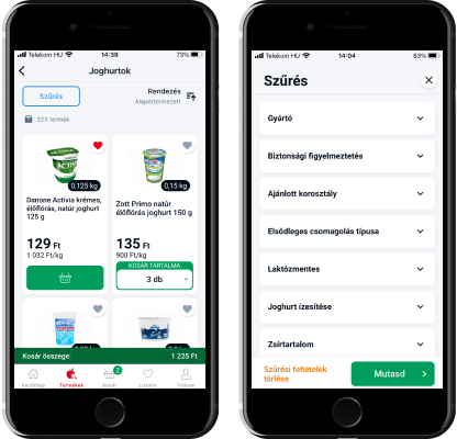
2. Making filtering and sorting more transparent
Users used to have trouble finding the sorting function before. The developers solved this by including it on the product list and putting filtering on a completely separate screen.
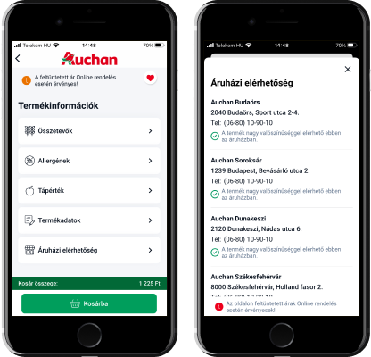
3. Modernising product landing pages
The dropdown menu was scrapped during redesign – following the new user habits.
Information (like nutrients, allergens) that was only present in the webshop before, are now appearing in the mobile app too.
Product cards were standardised for better transparency, starting by card size. The font size changes dynamically within the pre-defined textbox depending on the length of the text, so that there will be no empty space displayed.
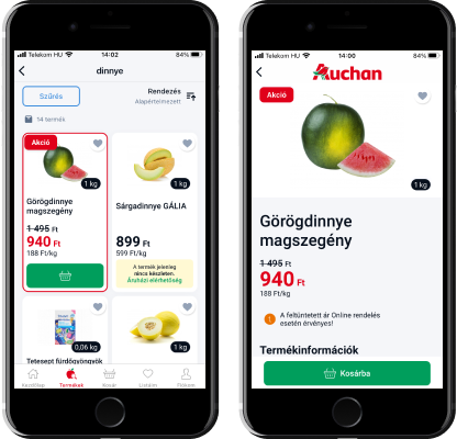
4. Clarifying the logic of placing into cart
In the previous mobile app the use of “plus” and “minus” buttons was not straightforward when placing goods into the cart. The developer team simplified this function by adding a number list containing the maximum orderable amount of the product (for example a list of numbers from 0 to 24 – picker view) where the user can pick the number of pieces to add to the cart. (For certain products the customer can see both the amount and weight of the product that had been added to the cart). This solution is unique on the domestic market and the user ratings also show that the audience had a positive reaction.
As another innovation, a sticky bar highlighted in green was placed over the bottom navigation, which shows the total value of goods in the cart.
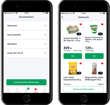
5. Favourites and shopping list updated
The previous application had a separate menu item for the favourites and the shopping list. This has been simplified in the new app by merging the two, including My lists (represented by a heart icon on the new screen) in the navigation list. When the users click it, they can choose the list where the product will be placed (e.g. monthly shopping).
6. Smoother checkout process
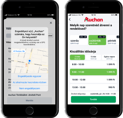
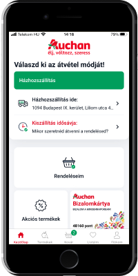
When choosing pickup options the new version only requires supplying the address (the app used to require postal code as well). Delivery will be going to this address, or in case of warehouse pickup Auchan suggests the nearest store based on the customer’s GPS coordinates.
The pickup time also got a new, more transparent look in the app.
7. More visual banners
The banners on the app’s main page got a nicer design.
8. More information
The stock availability, which used to be displayed at the Auchan webshop only, was added to the mobile application.
9. The app’s main screen has been updated
People, who download the app usually become regular customers. Considering this, items were added to the main page (based on customer feedback too), which support the ordering process for the existing customer base. One important element is the loyalty card: many people use the application to present their registered virtual card – in case they don’t have the plastic one - at the cash register.
The card has therefore been given a prominent place, accessible with a click from the main screen. Customers don't need to navigate to their profile screen within the app, they can easily find the card on the main screen.
Another change has also made it quicker to access the loyalty card and browse the app in general. Previously, users had to enter their postcode in a data request popup after each app launch so the app could check if Auchan is delivering to that area. This step has been removed. Once the delivery address is entered during registration, the app can filter which products are available in the user's area.
Another useful feature was added for the loyalty card, namely that the brightness of the screen is increased when reading the card. According to the feedback received, the users value this kind gesture. Accepting virtual loyalty cards at stores is also an example of how the offline activities can be connected with the online space via the app.
10. The onboarding process became more customer-friendly
The onboarding process becomes simpler once the app is downloaded. The customer can choose from logging in right away or first have a look at the application information.
Results
It also contributed to the project’s success that the teams of the two companies collaborated smoothly, and a lot of business knowledge and experience was shared by Auchan.
As the result of the development project concluded between October 2020 and February 2021, Auchan Hungary’s mobile application was not only enriched by a modern, beautiful design, but even the processes “under the hood” were modernised. The code base was refreshed, the architecture is based on the most recent technology and the app includes the experience of the LogiNet mobile team. All of that allows them to carry out future developments faster and to implement changes necessary for UX based on the continuous research done by the 22.design team.
By using the mobile application, customers are able to find products and compile carts much faster, and this is also confirmed by user feedback. Another success is that even the growing number of orders did not cause any hiccups up until now. The positive impact of the redesign of Auchan's mobile app was also reflected in the data: the number of active users, the number of orders placed and the traffic of the app increased significantly after the launch.
The redesigned app was received positively by the users: its rating is 4.6 for iOS and 4.6 for Android (close to 40 thousand users), which is much higher than the scores of the competitors.
Future plans
The direction of future developments for the Auchan mobile app has been determined based on customer feedback, even in terms of design. They are considering applying push notifications and the display of non-food products in the app.
Where can you access the Auchan mobile app?
>>> Get it on Google Play.
>>> Download on the App Store.
>>> Get it on Google Play.
>>> Download on the App Store.
Loginet Systems kft.
-
-
HQ address : Budapest 1221
Vihar St. 5D. bdg. 4. floor 15. -
-
-


